Saturday, April 13, 2019

Zoxe 101: Standard Colors III - Fun Colors

Spicy Colors

As time goes on, the tools and methods we use continue to evolve.  Sometimes it's a desire to try some new trick you read or saw, or sometimes it's a desire to try a different product to see what the fuss is about.

With every project, however, there seems to be a set of colors that you just can't get away from.  In Zoxe 101, I'm talking about tools/items/colors that find their way into virtually every project.

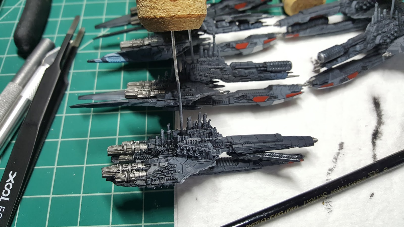
This time let's talk about some colors that I use in many of my models to add some spice.  In this case, let's do it with some pictures.


Reaper Rusty Red.  One of my top 5 colors.  It's not red, not orange, and not brown, and has a very organic look to it.  It goes down smoothly, and accents cool tones well.  I am incredibly sad that this line is now discontinued, but it looks like Reaper Carnage Red is a close approximation.

Here's some examples from the past year:


Friday, April 12, 2019

Suggested Reading

I started reading as a kid (in the 4th grade, I read Arthur C. Clarke's 2010) and have continued to read in spurts all my life.  In high school, I got into the original Tom Clancy novels

I am not a high volume reader.  In fact, I tend to go back and reread older books.  Certain stories or characters resonated with me, and over the years I've reread the work and gained different understanding.

Wildly crude example:  Reading Red Storm Rising as a high school freshman, I thought the planes and guns were supercool.  Reading the same book a couple of decades later, and I'm picking up the historical nuances of a Cold War Europe. 

Anyway, the books below changed my life, in some way or another.  No particular order.  I'll use bullet points.  Bullet points are cool.
  • Leviathan Wakes, James S.A. Corey
  • Red Storm Rising, Tom Clancy
  • CW2, Layne Heathe
  • One Second After, William R. Forstchen
  • Fight Club, Chuck Palahniuk
  • The Stand, Stephen King
  • Band of Brothers and Citizen Soldier, Stephen Ambrose
There's a lot of war and post-apocalypse on here, which maybe tell you something about me (hah).  


Saturday, April 6, 2019

Zoxe 101: Standard Colors II - Shades of Gray

As time goes on, the tools and methods we use continue to evolve.  Sometimes it's a desire to try some new trick you read or saw, or sometimes it's a desire to try a different product to see what the fuss is about.

With every project, however, there seems to be a set of colors that you just can't get away from.  In Zoxe 101, I'm talking about tools/items/colors that find their way into virtually every project.

This time, we're talking again about paint.  Let's get some 'boring' content out of the way with some grays.

Shades of gray.  Or Grey.

I'm not going to bulletize and break down each color like I did in the first post.  I bought this progression of neutral grays from Reaper while getting ready for my Dropfleet army, and began swapping these colors and retiring other options I had on the rack.

I don't use the full progression of all 5 colors on every model.  Instead, I grab the specific shade that I'm after.  For a airbrushed gradient (graydient, bwhahaha, ... er, ahem), I'm probably going to start with AP Necromancer Cloak (see first post) and then work up through Cloudy and Rainy.  Misty becomes my higlight color, and Stormy (which is just a little brighter than Necromancer Cloak) can be a shadow or a touch-up/blend color.

I like Reaper's consistency straight from the bottle; it's pretty thin and doesn't require a lot of fussing/adjustment before you can start painting.  Generally I put it straight on my wet palette, wet my brush, and begin w/o additional thinning.  If I need it just a little thinner, I spread it out on the palette so it pulls more water through the parchment paper (greater surface area, physics is cool).  If that doesn't work, then I dip my brush in water and pull in a few drops.

I will say that while most of my airbrushing experiences with Reaper have gone well, the Rainy Gray seemed to splatter more than other brands when making an airbrush gradient.  Could just be me or my setup, but there it is.  There are ways to mitigate this (using less of a dramatic step up in gradient, adjusting air pressure, using a detail airbrush, glazing/washing afterwards etc.) but wanted to caution you; for my project the end result was just fine despite some initial swearing.

Some would say this many bottles of gray is overkill; you can of course mix your own incremental shades.  For single figures this is probably faster (and cheaper).  For me, having these bottles front and center makes life simpler, and allowed me to add units to my Dropfleet army (for example) months later much more consistently.

White:  There are of course a ton of whites on the market.  Not all are created equal.  Recently I've started using Reaper's Pure White over another options on my rack, and can say that I've had good results using it for layered details and highlights. I will say that for the airbrush, I'd actually favor Liquitex Titanium White Ink, but that's the topic of a future post.


Wednesday, April 3, 2019

Adepticon 2019

The main hall at Adepticon. 40K and random game area here, vendor area behind, and Fantasy Flight gaming area way, way behind at the far end.  There was another large area for gaming upstairs.


Bottom Line Up Front (BLUF):
Our first trip to Adepticon.  We found this event to be welcoming and well organized, and all things considering, it's probably the goldilocks size ("just right").  The Swag bags are huge.  Lukewarm showers are disappointing.

>> Who should attend:  Wargamers, painters, fans of Fantasy Flight organized play

>> Who might be disappointed:  RPG/DnD, MTG players, boardgamers/eurogamers, shoppers

Tuesday, April 2, 2019

Zoxe 101: Standard Colors


Hi!  I am getting ready for Adepticon.  I'll set this to robo-post.

As time goes on, the tools and methods we use continue to evolve.  Sometimes it's a desire to try some new trick you read or saw, or sometimes it's a desire to try a different product to see what the fuss is about.

With every project, however, there seems to be a set of colors that you just can't get away from.  Here's a quick post about 3 of them.  I'll do a few more down the road.

Standard Colors, Round 1 - Reaper Black Wash (yes, this counts as a color), AP Necromancer Cloak, and AP Gun Metal (aka Pistol Metal in the Brimstone kit)
  • Reaper Black Wash - This wash has found its way onto nearly every model that I've worked on in the past 14 months.  I count it as a 'color' because it's that distinctive.  Despite the name, the "Black" wash actually has a lot of BLUE in it, so don't mistake it for a clone of other products.  It makes blues and grays pop like nothing else.  It is quite dense; if I'm actually using it as a wash I tend to thin it at least 1:1 with distilled water or else it will overpower all your hard work.  Where the product really shines, though, is as a shader for nooks and crannies of your model.  If you have a place that needs to be dark but would look odd if it were pure black, grab the Black Wash and add a layer or two.  Sometimes I use the product both ways on the same model - for the KDM Watcher, I washed the entire model with thinned Black Wash and then I went back and put shadows in the folds of his cloak with unthinned.  The only complaint I have is that it really doesn't like 2 brush blending.  Apply it, but don't touch it again, don't try to move it or 'erase' it with a wet brush.  If you do, it will ball up and get gritty, and/or leave ponding marks.
  • AP Gun Metal - AP products have their haters online, but I really love their washes and their metallics.  For this silver, the metallic solids are fairly fine (can be airbrushed reasonably well). It's pretty thin coming out of the bottle, but can be thinned further and still cover well.  Unlike some other metallics, it doesn't cure too quickly and get goopy on the palette. In terms of the color, it's a neutral, fairly dark, and chewy silver.  It has a fair amount of black in it, perfect for worn metal or something that has seen some weather.  It is not going to look right on a larger surface (an entire robot, or something) but is the perfect complement to most color schemes and looks great applied as a basecoat with a colored ink over it.  (Bonus points: I typically use AP Chainmail Metal as a highlight color; which 'feels' the same but is brighter and less black). When finishing the DFC Fleet, I used Gun Metal as a dry brush over the entire model; it dry brushes exceedingly well and gave the ships a very worn, lived-in look.  I have tried other silvers (Reaper, Scale75) and always come back to my trusty friend.
  • AP Necromancer Cloak - I've written about this color before.  It is used on every (every!) one of my models somewhere, if only as a shadow color.  This is a charcoal gray that's very close to black - but isn't - so you can have it stand in for black when you need it to (black boots, black robes) and still have some room to provide shadows.  When I am basecoating with an airbrush, I almost always use this as the first color in the stack, and spray from below to provide shadows.  For KDM, this is the base layer of shadows for both heroes and monsters.  For Brimstone, it's the 'black' in cloaks and the Nun-with-a-Gun's habit.  For Dropfleet, it's the base layer, some panel lines, and some accent panels.  

Thursday, March 28, 2019

Hot off the Desk: Dropfleet Commander Notes and Pics


This is the wrap-up post for my Dropfleet Fleet.  I am scheduling to robo-post on THURSDAY, which is the day of the big narrative battle at Adepticon.  Because there was well over a year from start to finish, my techniques (and my ability) improved as I went.  I started taking notes early (as a draft post here) to fill in the holes in my flawed memory.

This project took far (far) longer than I expected it ever would.  This gives me just under 2000 points of ships that I can put on the table, but sadly after last years' GenCon acquisitions and other leftovers, I probably have another 1000 points (maybe more) that I could assemble and paint. 

On one hand this sounds hideous - I'm glad to be done - but on the other hand I am excited to see how some of this stuff plays at Adepticon and may return fully stoked for more time in the Zoxe Shipyards.  (I think if I carved it off in 2 or 4 ships at a time, I wouldn't feel so overwhelmed....)

If you're just here for pics, scroll down.
  • ASSEMBLY:  Assembly was pretty straightforward overall.  
    • The plastic models went together well with few gaps and only minor trimming (I don't think I filled ANY of the plastic models). The only complication was making sure I was building the right configuration (all the class types/names are confusing) but I contributed to this by wanting to field a list with a lot of variety.
    • Some of the resin is pretty fragile, and I broke a few antenna as I worked. On the plus side, I had no issues with paint adhesion.
  • PRIMER:  Vallejo Surface Primer, Black, applied w/ Badger 105 and thinned with Vallejo Airbrush Thinner.  Touch up primer by hand where required (Carrier bays in particular).
  • -- BASE COLORS --
    • Airbrush (105):  Necromancer Cloak, from front at 30 to 45 deg
    • Airbrush (105):  Reaper Stormy Gray - Sides and Top
    • Airbrush (Sotar):  Reaper Misty Gray  - Nose and nacelles
    • Airbrush (Sotar):  Blue Ink aft nacelles and chin
    • Airbrush (Sotar):  AP Dark Tone - center aft
  • PANEL LINES:  Reaper Black Ink and AP Necromancer Cloak.  The bane of my existence. For the frigates, I skipped this step.  For the cruisers I did this by hand, line by line, and it really sucked.  For the capital ships, I skipped this step and instead did a coat of Reaper Black Wash, thinned 1:1.
  • ACCENT PANELS:  Reaper Misty Gray and Reaper Rusty Red (which is sadly discontinued now). The Misty Gray likes to get chalky, I tried various mitigations but ultimately lived with some surface roughness
  • SQUADRON STRIPE MASK - Tamiya 10mm gap, 2mm accent, then use the Sotar to shoot the stripe in Reaper Misty Gray
  • ENGINES:  The frigates used Reaper Smoky Silver / Gunmetal Blue wet blend.  On Cruisers and larger, I basecoated all in AP Pistol Metal.
  • -- DETAILING --  
    • GUN BARRELS:  Reaper Adamantium Black
    • Dry Brush (entire ship): AP Pistol Metal, then AP Plate Mail Metal on Launchers and vents and other silver things.
    • Liquitex Burnt Umber Ink (Sotar): Vents, blast marks, soot, and engines.  The New York got a little bit of Burnt Sienna as well
    • ENGINE EXHAUST: Reaper Mithril Silver >> AP Crystal Blue >> Mithril Silver center dot, do this fast and wet blend it (for later ships, I skipped the initial coat of Mithril Silver and it worked fine).
    • For the hanger bays on the New York, I used Liquitex Titanium White ink to light the bay, then used AP Phoenix Flames for the yellow/orange light in the same area.  (Yellow is too transparent to hold up well w/o an undercoat of white).  Then touch up dry brush w/ AP Pistol Metal.
    • The doodads on the top of the New York were dry brushed with Scale75 Necro Gold. I also used Necro Gold on the Johannesburg's nose. 

A very early shot of the cruisers. This looks like I've done the Necromancer Cloak and Stormy Gray. I found the Stormy Gray to splatter a bit with the airbrush; would try AP Uniform Gray next time 
Early shot of the New York.  Note the scale compared to paint bottles.


Early shot of the Johannesburg.

Starting to do panel lines on the Frigates. Early on, I was only going to use Misty Gray (simulating white) and added the Rusty Red on a whim.

Trying the Rusty Red.

Months elapsed between the previous picture and this one.  Here, I had just basecoated the engines in silver.


Cruisers, finished and off their corks. A few minutes later they were glued to their clear adapter peg.

Beijing class battleship, freshly striped, engines basecoated, and ready for final detailing.  I used AP Blue Tone Ink to shade the engine nacelles to give more 'pop' to the stripes.

New York and Beijing, fresh from stripes and engines basecoated.  The accent panels on these two ships are similar, but intentionally different (big ships could be built years apart and customized by their crew).

Finally, the entire Fleet - assembled together for the first time.  Front to back:  Corvettes, Frigates, Light Cruisers, Heavy Cruisers, then in the back are the two Battleships (upper left) and the Battlecruiser (upper right).

Frigates. DFC has an interesting rule in that in some scenarios not all the ships are on the board at the beginning, and are placed in later turns based on tonnage.  I have a few squads of scrappy frigates and light cruisers to jump on the board in those opening rounds.  

The Johannesburg-class battlecruiser, decent profile shot of him (though his guns are facing the other way, gah).  Directly behind him is a Moscow-class heavy cruiser.  Both of these ships are gunships, but the big J adds more missile launchers, and more HP. 
Moscow and another cruiser directly behind.  One concern I have is that the list I built is kind of a kitchen-sink build. I have a LOT of different classes of ships (so much that I'm having trouble remembering the names).  Using all of them to their full potential will probably take more skill than I have.


Various cruisers.  Upper left is my blue-striped carrier.  The cargo pod on the one in the center is used to drop ships to the surface (hence the name Dropfleet). My other ships will attempt to draw fire and die gloriously to protect this one.  In order to win, players score points by dropping armies into cities and holding them.  My list is admittedly light on Drop and will attempt to win by BSU (blowing [stuff] up). 
New York class Battleship.  Not a lot of guns but launches waves of missiles and also serves as a carrier.  I experimented with adding ambient light to random carrier bays (I lit different bays on the reverse side).  I hit her with a little more weathering; big hulls like this will have been around awhile.


The Beijing-class Battleship.  An unapologetic gunship; direct descendant of WWII heavy iron.  The two battleships will roam as a pack next Thursday, hunting for other capital ships. 
Top view.  Each battleship had a launcher that was broken when I received it.  If you look closely you can see where I attempted to simulate battle damage (hint, the New York's damage is on the passenger side nacelle, just under the vent/grate that's shaded brown, the Beijing's is on the driver side nacelle, top row of launchers).


Another shot of cruisers.

More cruisers; Moscow looking for trouble.

Comparison shot of the squadron stripes after they've been weathered and beaten up a bit.

 
Aft view. I tried to get a picture of the blue engine glows, which I'm happy with, but the lighting wouldn't cooperate.
Profile shot of the Beijing. Tried to soot up the after hull behind the engines with Liquitex Burnt Umber ink.  The underbelly of all the ships is mostly AP Necromancer Cloak simply dry brushed with AP Gun Metal.  Fast and effective. 


New York:  3/4 view showing the hanger bays.  The ships are so long it's impossible to get the entire thing in focus on my camera.
As with all things, there are always MORE things you can do.  I'm looking at these pictures now seeing additional details I could pump in.

Maybe I'll get the gumption to unbox the London-class Dreadnought (it's bigger than the New York).

Sunday, March 24, 2019

Hot off the Desk: Shadows of Brimstone Derelict Ship Broken Grates

There's probably a better name for these.

Flying Frog sells a pack of 4 resin tiles that replace cardboard tokens on the Derelict Ship expansion.

Similar to the Corpse Piles a few weeks ago, I decided to hit these quickly and see what I could do with a limited time budget.

Methods were pretty simple:

  • I'm now washing resin pieces in 70% isopropl alcohol (not soap), scrubbing lightly with a toothbrush, rinsing with water, and letting air dry overnight.
  • Primer:  Stynlez, black. Applied with airbrush.  I'm a recent convert to Stynlrez, mostly because it doesn't require thinning before airbrushing.
  • Base coat:  
    • Metal decking:  AP Gun metal (airbrushed for speed)
    • Wash:  AP Dark Tone Ink
    • Pipes: AP Dark Stone wet blended to Scale 75 Necro Gold.  This is such a great combo; super easy to blend.  Once dry, I came back with a S75 Dwarven Gold highlight and touched up some of the ribs/recesses with AP Necromancer Cloak.  The Necro gold has green/brown undertones, the Dwarven gold is brighter with some red in it; the colors aren't that far apart but the highlight pops naturally thanks to the contrasting tones.  This combo (Stone/Necro/Dwarven) has been my go-to for hoses and doodads on a few Brimstone projects now.
    • Dirt / dark areas: AP Dark Stone.
  • For a burnt look, I airbrush shaded areas with AP Purple Tone Ink, then went back over partially with Liquitex Burnt Umber.  This makes the silver look like it got hot (purple) and then got sooty.
  • AP Chainmail Metal for edge highlights on the torn metal.
  • AP Blue Tone Ink (airbrushed) for some color
  • AP Matt Black around the edges of the tile

Sprayed with AP Gun Metal Silver and then given a wash in AP Dark Tone Ink.  Here I'm basecoating pipes with a blend of AP Dark Stone and S75 Necro Gold.

First pair painted and shaded, ready for a little more edge highlighting.

Second pair.  Basecoated in AP Pistol Metal, then a quick coat of AP Dark Tone Ink.  I dry brushed the hex metal again with Pistol Metal to brighten.  Here I'm filling in the Dark Tone in the center (which is still wet!).

Shading the metal w/ Burnt Umber before basecoating the pipes/hoses.
Finished product. Total time investment is maybe 2 hrs (rounding up).  Keep it simple and on to the next.

Saturday, March 23, 2019

Happy DFC is Done Day


The past 2 or 3 weeks has been a slow ramp-up to Adepticon and finally (FINALLY!) getting my Dropfleet Fleet on the table.  And while I'd rather stage some decent photos, I wanted to say here that a few minutes ago I sat down the last brush on the last ship, and poured a whisky.  Now just I need to get the last 3 ships off their corks and glue in the base adapter, then organize and pack everything for Adepticon - which starts for us on Wednesday evening.

This has been a long project in the making.  I started assembling the bulk of this army about a year ago.  Looking back at it, the project really wasn't that bad, but a couple of the steps involved were incredibly tedious and I avoided the ships for several long spans.  I don't think being a commission painter is ever in my future.

It'll be good to have these off the bench.  I have a couple of things I want to tackle before I start my GenCon and ReaperCon projects.

Bench shot of the cruisers, fresh off their corks and before the clear base adapter peg was installed.

I carried the Squadron Stripe idea up through the battleships.  This is WIP just after I basecoated the engines but before I started any weathering or other detailing.

Two battleships, side by side. Also WIP at the same stage as above.  Each of these ships is larger than my cell phone.

Once the dust is settled, I'll try to grab some finished shots.

Sunday, February 24, 2019

Shadows of Brimstone Kickstarter #3


Last week, I was a little surprised to see an update from Flying Frogs announcing their next Kickstarter.  Details were scarce, but there it was.  I wasn't incredibly surprised that there would be a third campaign, but it caught me off guard a bit  that they'd be kicking it off right now without much build-up. 

But no, we got a few days heads up, a couple of Facebook posts, and it's off to the races with a relatively short, 14d campaign.

This time around they're launching their "Adventure" boxes, which are a pair of basically mini-cores.  Intent is apparently an easier starting point for new fans, and good integration with the original two cores (Swamps of Death and City of the Ancients).  In this smaller box will be the usual "stuff" - map tiles, figures, cards, gear, missions, but scaled back a bit (e.g. fewer map tiles than a full core).

New mechanics will be "team" heroes - apparently instead of 4 unique heroes all with their own skills, skill trees, and mechanics, each of the 4 Adventure heroes will effectively be of the same class.  (Therefore less playtesting and fewer balance issues with an already large Brimstone universe).

There's a bit of apprehension about the team heroes, as it feels like "less," (less content, less customization).  I'm actually okay with it - in our house we typically play 2-player, it will be easier for us to run a full squad of 4 without having to remember all the nuances of 4 unique heroes. 

The campaign is off to a roaring start already - pushing $650k at the 23 hour mark and smashing through stretch goals. 

Anyway, I'm all-in on this one.


Wednesday, February 20, 2019

This Week's Distraction: Diablo 3 Season 16


It's been quite awhile since I've played any meaningful Diablo 3 content.  When the game originally launched, I played through, but was quickly bored with the grind and steep difficulty curve.  (And, at launch, the real money auction house and a couple of classes that were nigh unplayable).

It's been several years, and Blizzard has continued to tweak the title and make incremental improvements.  A friend mentioned that Season 16 had commenced, so on a whim I popped in and rolled a fresh Crusader. 

What became clear to me is that:
a) after several years away, the core satisfaction - smiting oodles of baddies - is very much still there, and in some ways amplified.
b) after several years of playing board games, D3 offers a really great dungeon crawl on par with Shadows of Brimstone, or the tabletop RPG that we played last week with friends (D&D5E).  Sure, the pacing is different, and D3 is far more mindless, but the but it's been a really excellent way to scratch the same itch, and do it in ways that WoW or GW2 simply can't.

So, anyway, that's this week's distraction. I'm sure it won't last, but I'm enjoying the ride for now.


Monday, February 4, 2019

Dog Might Games: Custom Kingdom Death Gear Grids

Looking back through my posts, I realized I never actually uploaded these pictures.  Let's fix that!

Very early in our KDM career, I knew that the stock cardboard grids that come stock in the game were a pain.  If you look away for a SECOND, the gear cards spin and dance and rearrange themselves.  

I wanted a solution.

But I was picky.  There were some acrylic and laser cut ply options on the market, and 3D printable files around, but I wanted something a little more ... deserving ... of the great title that KDM is.

At PAX Unplugged 2017, I stopped in at the Dog Might Games booth and struck up a conversation with someone that I would later know as Zoey.  

I had a particular request - Gear Grid for Kingdom Death.  She politely pointed me at some of the other card and table organizers they had in stock, and I kept shaking my head.  We had an otherwise great chat, and Mrs. Zoxe found a prototype dice box for sale from their PAX stock.  And, after a return trip or two we caught up with Konas, one of the founders at DMG.

I wrote up my idea, did some sketches in MS Paint, and sat down with real cards and took some dimensions.  They were receptive to the idea of a custom commission, but wary because a) the cost would be spendy and b) they were really (super mega) busy.  I think maybe I had to convince them that I was serious. :)

We traded emails back and forth over the coming months, and this past September, they were able to work me into production.  


KDM Gear Card being measured; yes, I broke out the calipers.

With so much BoRo at risk, they cut a prototype and shipped it to me.  I loved it, and brought it back to them at GenCon 2018 with final tweaks.

Unboxing.

All four player stations in a big row.

The first words from the KDM manual included as an engraving:  "Once upon a time there was a place of carved stone faces."  (Harder to read in the glare than it is in person).

Side view showing magnets for future Component Collector integration.  Each pocket is sized to take a single 2x2 gear card and is angled a bit for easier readability.

And they felted the back.  Super cool.

This was a super splurge on my part but they came out wonderfully.  And you might think that it's a lot to spend for a single game title (you'd be right), but they do have uses beyond KDM.  One or two on the table make a wonderful collection point for tokens in almost any game.

I didn't post these pictures initially because I didn't know if DMG was interested in building more, considering all the other projects they have going at once.  Konas later said they'd build more if people are interested, and for my part I don't claim any particular ownership over "my" design.  It was a great collaboration, and if DMG can put a few more on the street, it's fine by me!

Dog Might was fantastic to work with.  I've gotten to know the gang a lot better through their forum and am happy to see their business continue to grow.  Since that first PAX, we've added several other DMG pieces to our table and I'm happy with them all.  But the real showcase are my Gear Grids.  

Sunday, February 3, 2019

Overhaul

In the post-before-last, I questioned whether House of Zoxe should continue on.  I wasn't really in a mindset to pack it in, but I was kind of questioning my motives and how to increase visibility.  Pevil jumped in and was a great sounding board, and the result of that conversation resulted in just a few minor tweaks that I could make to increase my own enjoyment with this project.

So here's the line in the sand, the milestone, the point where I overhaul.

FIRST - Repeat visitors will notice the new layout.  After using the a more graphical/modern layout for the first year or so, I'm taking a step back to something a little more basic. 

I'm curious if part of the problem with keeping all y'all's attention was the theme.  So it's gone.  (Two sub-notes:  a) Expect more tweaking as we go, and b) you might find some broken formatting in older posts. I'll fix it if I see it but I'm not auditing everything right now).

As a side benefit, I'm no longer forced to include an image in every post (it broke the old theme), which means I might be inclined to type stray thoughts without feeling like I need to stop and dumpster drive for an appropriate image.

SECOND - I'm going to delve into some additional personal writing.  This is my platform, my outlet, and there's more to Zoxe than just airbrushing little army men.  You've been warned.

I stayed away from this kind of non-gamer content intentionally because I felt like it diluted the blog a bit, and if I go through a period where I'm not gaming/painting, then it becomes post after post of randomness.  My EVE blog went through this in its death throes.  But I also think that it could spice things up and perhaps make this a page worth bookmarking.

THIRD - I have a few projects in the hopper, but I'm also shifting my methods a bit to focus on volume over perfection. 

This fall, I stepped back from the path I was on.  I'm an "okay" painter and I don't aspire to perfection.  The "expected" path is that as a mini painter, I should aspire to finer control, more difficult techniques, cleaner blends, better basing, and incrementally better and better results - inching and clawing and begging and pleading towards higher and higher levels of quality.

The mini-painting community is great - friendly, inclusive, and creative.  But for some of us the moving of the goal posts becomes unhealthy. 

I needed to remind myself that I started in the hobby NOT intending to paint but just to PLAY the damn games.  My very first figures were a 3 or 4 step process (Prime, basecoat, wash, dry brush).  There's a slippery slope of adding complexity to a painting process to add some detail, pull up a highlight, push a shadow, fix a line, add some freehand.  There's a peer pressure aspect to it, there's a self motivation aspect.  I'm not sure how else to describe it.

Anyway, I need to not obsess and just shut up and paint.  I'm okay with a "Tabletop plus" result.  I'm going to screw up some models, learn some things, and be okay with it.


Saturday, February 2, 2019

This Just In: Dog Might Component Collector

Straight from the box:  Component Collector in storage mode.


Once the recent cold snap lifted (I refuse to use the term 'Polar Vortex' ... oh damn, I just did), our USPS mail delivery resumed.  

I came home from work yesterday to find a greatly anticipated package on my doorstep:  Dog Might Games delivered my Component Collector Kickstarter pledge!  (And there was much rejoicing).

This was an interesting campaign.  Each backer was able to pick their wood species and tile layout from a long list of options.  My particular setup is a Bolivian Rosewood (BoRo) kit.  I chose one dragon sculpt to show, three Square tiles, two 'L' tiles, and two Counter tiles.  The tiles stack in a base that doubles as a personal rolling tray or another larger token tile, and once stored a leather strap keeps things together.

All of it is magnetized and smartly indexed to create a grid that clacks together with a satisfying 'schnock!' sound.  Once together, no small amount of table shenanigans will knock the tiles around.


3/4 View. 

Unpacked and gridded together.  I intentionally took this and the next picture partially in/out of the sun, so you can get an idea of the luster of the BoRo.  It's yummy.  I lucked out and get quite a bit of figure/character in my pieces.

Deployed with some Shadows of Brimstone bits.  For scale, most of these tokens are a little larger than a U.S. dime,and the dice are 'standardish' sized poly dice (also from Dog Might; their Bone Box from a previous campaign is shown above).

So far, I've just played around with these staged photos, but for token-heavy games like Shadows of Brimstone I'm looking forward to adding some sanity to our table.  I probably won't use the counter tiles all that much, but the dials simply lift out and the remaining recess will hold things fine.


Two CoCo tiles magnetically locked to the Dog Might Kingdom Death gear grids that I had done as a commission a few months ago.  I can continue to chain tiles to this "dashboard" as I see fit.  Super happy that we added the magnets, Konas.